Visualizing Cancer
Kirtan Padh, Luis Medina, Sharbatanu Chatterjee
This website has been designed for an optimal use in Google Chrome
The Story of Cancer
This is a story of the emperor of all maladies, or rather, its future. Nearly 1 in 6 deaths in the world is due to cancer, making it a major problem for human potential. Traditional therapies for cancer depend often on how early in the stage of cancer the diagnostics can be done. Also, more often that not, the effectiveness of the cancer treatment depends on the particular subtype of cancer as well as the genetic makeup of the cancer patient. With the growth of large data sets and methods of analysis in biology, it is becoming increasingly easy to develop and use data analysis and visualisation methods to extract relevant insight from them which would help doctors and clinicians tackle the problem of early and personalised diagnosis as well as treatment.
We will now look at the case of a hypothetical future clinician, who works with the data scientist, the patient, the power of research behind her, and using data visualisation to help the patient who has come to her for being diagnosed.
Clinique du Futur
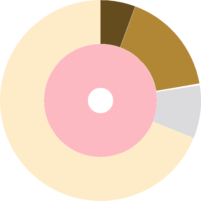
Our clinician has the backing of the scientists who compiled this excellent database of cancer genomics, known as TCGA to put at her disposal. The dataset has been visualised by our dataviz experts (ahem ahem) and compiled into a nice sunburst!
The sunburst is shown below. The hierarchical arrangement of the circles from inside to out represents the questions to be asked to the patient by the clinician. Our hypothetical questions might go like ...
Clinician : What biological sex were you born into, irrespective of what you identify as?
and so on...
The questions detail step by step what all to select from the sunburst.Click on the layers according to the answers in the sunburst below (In case you want to go back to the upper level just click on the circle in the middle):
Once the future clinician is done, she can just look up at the number of datapoints she has from the previous database on someone like the current patient. That is the percentage shown above. Armed with this prior knowledge, she proceeds to the next step of the diagnosis, locating similar people in the patient graph. Let us follow her.
See the code and process book Watch the screencast by pressing here.